At the end of the session, participants will be able to:
Merge two datasets using a common column.
Discuss which descriptive statistics would you use to describe the cases
Describe the cases by person and place (this is an outbreak in a high school, so we won’t explore “place” this time!)
Generate preliminary hypotheses bases on the descriptions.
2. Story/plot description
You have received the laboratory results for the samples collected from some of the cases. The lab conducted an RT-PCR panel targeting various gastrointestinal pathogens and also gathered additional metadata. Your task is to merge the questionnaire data with the data you have received from the lab, using the unique identifiers that both datasets share (id column), and explore that lab data. What does it tell you?
Once your dataset is clean and the lab data merged, you can describe the people identified as cases so far and generate a hypothesis to inform the next steps in the outbreak investigation. Note that you should try to have a data analysis plan before any data collection. Nevertheless, during the urgency of outbreak investigations, questionnaire development may sometimes occur before you had time to draft a proper analysis plan (as it is the case in this simulated outbreak). Drawing “dummy” tables and graphs will help you precise the type of statistics you will carry out later on.
3. Questions/Assignments
If you closed your R project, please open it again and load the clean dataset. We recommend you use the Spetses_clean2_2024.rds. This is just to be sure all needed changes in that file for the code to work have been done (as you may have changed the file in a slightly different way than we have).
3.1 Install packages (if needed) and load libraries
Show the code
# Load the required libraries into the current R session:pacman::p_load(rio, here, tidyverse, skimr, plyr, janitor, lubridate, gtsummary, flextable, officer, epikit, apyramid, scales)
3.2 Import your data
Show the code
# Import the clean data set:copdata <- rio::import(here::here("data", "Spetses_clean2_2024.rds"), trust = T) lab <- rio::import(here::here("data", "Lab data.xlsx"),skip =1) # skip the first row.
3.3 Merge and explore the lab data. Explore it as you wish!
Show the code
copdatalab <-left_join(copdata, lab, by ="id")# Tabulate:janitor::tabyl(dat = copdatalab, "RT-PCR_ecoli_etec")
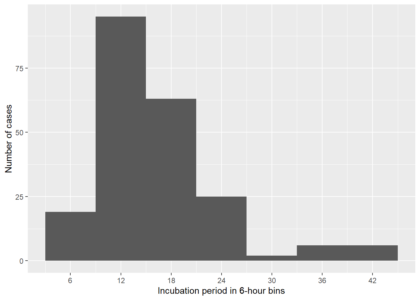
a) Create a histogram to visualize the incubation period (geom_histogram is a good function to use for this!).
Let’s stop and… think!
What can you infer from the incubation periods in the histogram?
Show the code
#| label: inc_time# Create a dataset with only casescases <- copdata %>%filter(case ==1)incplot <- cases %>%# Create an empty ggplot frame:ggplot() +# Add a histogram of incubation:geom_histogram(mapping =aes(x = incubation), # Set bin widths to 6 hours:binwidth =6) +# Adapt scale to better fit datascale_x_continuous(breaks =seq(0, 48, 6)) +# Label x and y axes:labs(x ="Incubation period in 6-hour bins",y ="Number of cases")# Print plot:incplot
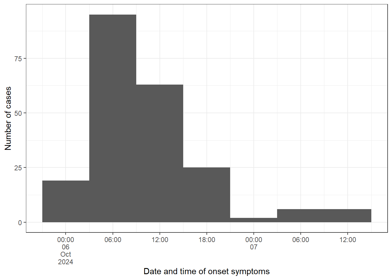
b) Create an epicurve for the date and time of onset (using onset_datetime), limiting the input data to cases.
Use scale_x_datetime() and chose a value for date_breaks() based on your calculated incubation period.
Label your x and y axes using labs().
Need a little bit of help?
A rule of thumb is to use one third or one fourth of the average incubation period as an interval. For our investigation this means we should use approximately a 6h interval for the date_breaks argument.
Show the code
# Create a vector with sequences every 6h from the first to the last casebreaks_6h <-seq(from =min(cases$onset_datetime, na.rm =TRUE),to =max(cases$onset_datetime, na.rm =TRUE),by ="6 hours")# Fetch cases data:epicurve_datetime <- cases %>%# Add factor onset_datetime to ggplot aesthetic:ggplot(mapping =aes(x = onset_datetime)) +# Add geom_histogram:geom_histogram(# Apply the vector of requences created abovebreaks = breaks_6h) +# Adapt scale to data and adjust axis label angle:scale_x_datetime(date_breaks ="6 hours",labels =label_date_short()) +# Update x and y axis labels:labs(x ="Date and time of onset symptoms", y ="Number of cases") +# Remove unnecessary grid lines:theme_bw()# Print epicurve:epicurve_datetime
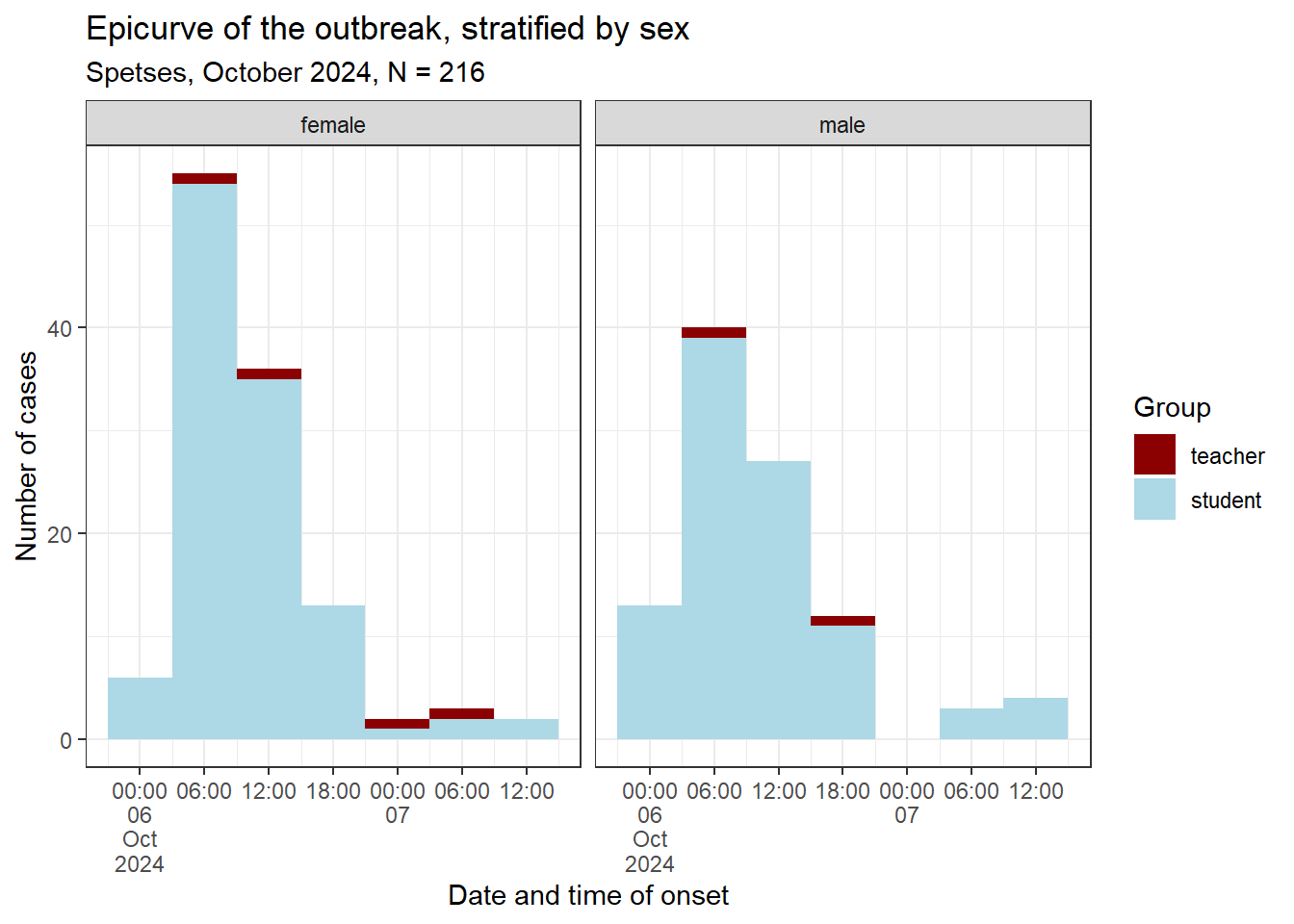
Building up on your previous epicurve, create another epicurve to compare between sexes and additionally investigate how teachers versus students were distributed.
Use fill = group
Use sex as your facets for facet_wrap()
Need a little bit of help?
fill adds an additional variable to be displayed in the plot: group is going to determine the fill-colour of our bars. facet_wrap splits the graph in two: one each for the two levels of sex.
Do you feel like a challenge?
If you want, try using str_glue() to add the total number of cases to the sub-title of the plot. str_glue() is a very useful function that allows you to dynamically create a summary statistic from your data within some normal text.
Show the code
epicurve_strata <- cases %>%# Add factor onset_day to ggplot aesthetic:ggplot(mapping =aes(x = onset_datetime, fill = group)) +# Add nicer fill colours:scale_fill_manual(values =c("darkred", "lightblue")) +# Add geom_histogram:geom_histogram(# Apply the vector of requences created abovebreaks = breaks_6h) +# Adjust x axis scales to a suitable unit:scale_x_datetime(date_breaks ="6 hours", labels =label_date_short()) +# Update x and y axis labels:labs(x ="Date and time of onset", y ="Number of cases", fill ="Group", title ="Epicurve of the outbreak, stratified by sex",subtitle =str_glue("Spetses, October 2024, N = {sum(copdata$case)}")) +# Stratify by sex:facet_wrap(facets ="sex",ncol =2) +# Add theme:theme_bw()# Print epicurve:epicurve_strata
Let’s stop and… think!
What does the stratified epicurve tell you? Does the shape of the epicurve support a viral or toxic aetiology? What other information can you obtain from it?
If you’ve thought about the above questions, have a look here
When constructing an epicurve, we need to decide on the resolution, i.e. the time interval for a single bar. A rule of thumb is to use one third or one fourth of the average incubation period as an interval. For our investigation this means we should use approximately a 6h interval.
This seems a good choice, as we saw that the daily interval was too coarse to really see the signal we are after. The epicurve and the summary of the incubation period show that there seemed to be a rapid onset of symptoms following exposure. This is in line with our previous suspicion that a virus or a toxin might be the causative agent in the outbreak.
The unimodal shape with the sharp peak suggests a point source, while the tail on the right-hand side could be explained by secondary cases or background noise. Also, people that only consumed a little contaminated food and therefore only a low infectious dose could have a longer incubation period and could explain the late cases.
The above results are in line with norovirus as the prime suspect, but the symptoms are not a textbook fit. There are too few people that experienced vomiting! Looking forward to receiving the lab results!
If you’ve thought about the above questions, have a look here
The distribution of the cohort regarding sex, group and class also didn’t reveal anything unusual. Students seem a bit more affected by the outbreak than teachers and the attack rate is higher for older students in higher classes. This, however, is a purely descriptive result.
Do you feel like a challenge?
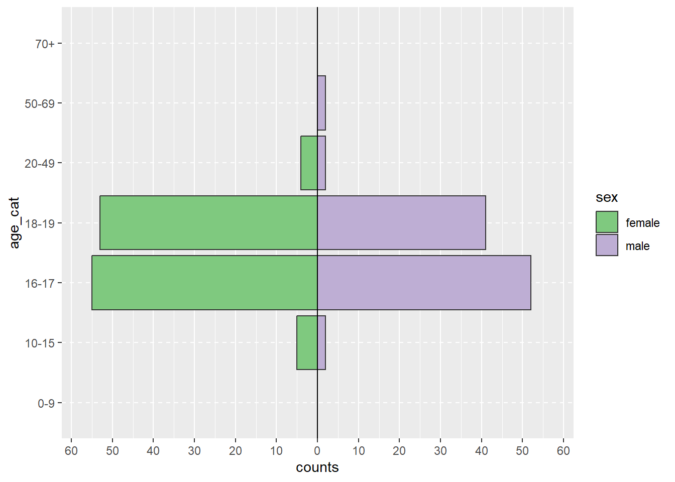
If you want, create an age-sex pyramid using the apyramid package. To do so, first create an age category variable with the epkit function age_categories().
c) Extra - Age-sex pyramid of cases.
Hint: Change show_midpoint = FALSE to TRUE to see skewedness in the data patterns more easily.
Show the code
copdata <- copdata %>%# Create age categories:mutate(age_cat = epikit::age_categories(# Name of age column:x = age, # Define the age categories:breakers =c(0, 10, 16, 18, 20, 50, 70) ) )# Check age categories:janitor::tabyl(copdata, age_cat)
Show the code
# Pipe copdata:agesex <- copdata %>%# Filter for cases only:filter(case ==TRUE) %>%# Create age sex pyramid: apyramid::age_pyramid(# Specify column containing age categories:age_group ="age_cat",# Specify column containing sex:split_by ="sex", # Don't show midpoint on the graph:show_midpoint =FALSE )# Print plot:agesex
3.6 Explore the distribution of all clinical signs (symptoms).
a) Create a summary table with symptoms stratified by case definition, and present an overall column as well. You could use tabyl() or gtsummary::tbl_summary(). You can find further information about gtsummary in The Epidemiologist R handbook section on gtsummary.
Show the code
# Create summary table:tabsymptoms <- copdata %>%# Select person characteristics to summarise:select(case, diarrhoea, bloody, vomiting, abdo, nausea, fever,headache, jointpain) %>%# transform clinical symptoms to factors, so NA can be accounted properly in the table dplyr::mutate(across(.cols =c(diarrhoea, bloody, vomiting, abdo, nausea, fever,headache, jointpain), .fns =~as.factor(.))) %>%# The enxt paragraph does not work with Rversion 4.4.0# Make NA a explicit level of factor variables# dplyr::mutate(# across(.cols = c(diarrhoea, bloody, vomiting,# abdo, nausea, fever,headache, jointpain),# .fns = ~forcats::fct_na_value_to_level(.))) %>% # Create the summary table: gtsummary::tbl_summary(# Stratify by case:by = case, # take care of missing valuesmissing ="no", # Calculate row percentages:percent ="column",# Create nice labels:label =list( diarrhoea ~"Diarrhoea", bloody ~"Dysentary", vomiting ~"Vomiting", abdo ~"Abdominal pain", nausea ~"Nausea", fever ~"Fever", headache ~"Headache", jointpain ~"Joint pain") ) %>%# Add totals:add_overall() %>%# Make variable names bold and italics:bold_labels() %>%italicize_labels() %>%# Modify header:modify_header(label ="**Characteristic**",stat_0 ="**Overall**\n **N** = {N}",stat_1 ="**Non-case**\n **N** = {n}",stat_2 ="**Case**\n **N** = {n}", )# Print the table:tabsymptoms
Characteristic
OverallN = 3771
Non-caseN = 1611
CaseN = 2161
Diarrhoea
0
46 (18%)
40 (100%)
6 (2.8%)
1
206 (82%)
0 (0%)
206 (97%)
Dysentary
0
189 (97%)
42 (100%)
147 (97%)
1
5 (2.6%)
0 (0%)
5 (3.3%)
Vomiting
0
149 (69%)
42 (100%)
107 (62%)
1
66 (31%)
0 (0%)
66 (38%)
Abdominal pain
0
35 (14%)
6 (12%)
29 (15%)
1
207 (86%)
44 (88%)
163 (85%)
Nausea
0
55 (25%)
12 (26%)
43 (24%)
1
169 (75%)
34 (74%)
135 (76%)
Fever
0
127 (74%)
32 (80%)
95 (73%)
1
44 (26%)
8 (20%)
36 (27%)
Headache
0
83 (38%)
11 (25%)
72 (41%)
1
137 (62%)
33 (75%)
104 (59%)
Joint pain
0
159 (85%)
32 (84%)
127 (85%)
1
29 (15%)
6 (16%)
23 (15%)
1 n (%)
Let’s stop and… think!
Do you think the symptoms selected for the case definition were the right ones, or would you change anything?
Do you feel like a challenge?
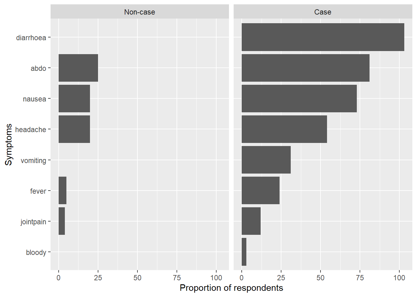
If you want, present the symptoms in an ordered bar chart. To do so, reshape the data using pivot_longer(), and then group_by(), summarise() and count() to tally up the counts for each symptom, stratified by case definition. Use ggplot2::coord_flip() for a better visualisation.
b) Extra - Bar plot of symptoms stratified by case definition.
Show the code
# Create list of symptom variables:symptoms <-c("diarrhoea", "bloody", "vomiting", "abdo", "nausea", "fever", "headache", "jointpain")# Create nice labels for case definition:caselabs <- ggplot2::as_labeller(c("0"="Non-case", "1"="Case"))# Select variables and cases:symptom_bar <- copdata %>%# Select symptom columns:select(case, c(all_of(symptoms))) %>%# Drop NAs:drop_na() %>%# Reshape (pivot longer):pivot_longer(!case, names_to ="Symptoms", values_drop_na =TRUE) %>%# Keep only TRUE values:filter(value =="1") %>%# Group by symptoms and case:group_by(Symptoms, case) %>%# Count for each symptom by case: dplyr::summarise(count =n()) %>%# Create plot:ggplot(mapping =aes(# Order symptom bars so most common ones are ontop:x =reorder(Symptoms, desc(count), decreasing =TRUE), y = count)) +# Display bars as proportionsgeom_bar(stat ="identity") +# Update x axis label:xlab("Symptoms") +# Update y axis label:ylab("Proportion of respondents") +# Flip plot on its side so symptom labels are clear:coord_flip() +# Facet the plot by (labelled) case:facet_wrap(facets ="case",labeller = caselabs,ncol =2)
`summarise()` has grouped output by 'Symptoms'. You can override using the
`.groups` argument.
Show the code
# Print plot:symptom_bar
3.7 Attack proportions
a) Calculate the overall attack proportions (percentage of cases among the total observed individuals). You could use tabyl().
Show the code
# Create table of case status:total_ap <-tabyl(copdata, case) %>%# Add row totals:adorn_totals(where ="row") %>%# Add percentages with 1 digit after the decimal point:adorn_pct_formatting(digits =1) %>%# Filter to rows where case is TRUE:filter(case =="1") %>%# Select the column percent:select(percent) %>%# Extract (pull) the value from this cell:pull()# Print result:total_ap
[1] "57.3%"
Let’s stop and… think!
What can you infer from the overall attack proportion about this outbreak and possible vehicles/exposures?
If you’ve thought about the above questions, have a look here
The overall attack proportion is 57.3%. This means that more than half of the people who ate a meal were cases!
b) Calculate attack proportions for group, class and sex by case status. You could use tabyl() (as you did in 3.4) or gtsummary::tbl_summary.
3.8 Draft the relevant paragraph(s) and table(s) and/or figure(s) in your outbreak report (Methods and results).
Need a little bit of help?
To save your tabyl table as a .docx, you could convert your tabyl to flextable (as_flex_table()), ensure only one line per row (flextable::autofit()) and save as .docx (flextable::save_as_docx(path = "nameoftable.docx")
Source Code
---title: "Laboratory data and descriptive analysis"editor: visual---## 1. Learning outcomesAt the end of the session, participants will be able to:- Merge two datasets using a common column.- Discuss which descriptive statistics would you use to describe the cases- Describe the cases by person and place (this is an outbreak in a high school, so we won't explore "place" this time!)- Generate preliminary hypotheses bases on the descriptions.## 2. Story/plot descriptionYou have received the laboratory results for the samples collected from some of the cases. The lab conducted an RT-PCR panel targeting various gastrointestinal pathogens and also gathered additional metadata. Your task is to merge the questionnaire data with the data you have received from the lab, using the unique identifiers that both datasets share (`id` column), and explore that lab data. What does it tell you?Once your dataset is clean and the lab data merged, you can describe the people identified as cases so far and generate a hypothesis to inform the next steps in the outbreak investigation. Note that you should try to have a data analysis plan *before* any data collection. Nevertheless, during the urgency of outbreak investigations, questionnaire development may sometimes occur before you had time to draft a proper analysis plan (as it is the case in this simulated outbreak). Drawing "dummy" tables and graphs will help you precise the type of statistics you will carry out later on.## 3. Questions/AssignmentsIf you closed your R project, please open it again and load the clean dataset. We recommend you use the `Spetses_clean2_2024.rds`. This is just to be sure all needed changes in that file for the code to work have been done (as you may have changed the file in a slightly different way than we have).## 3.1 Install packages (if needed) and load libraries```{r}# Load the required libraries into the current R session:pacman::p_load(rio, here, tidyverse, skimr, plyr, janitor, lubridate, gtsummary, flextable, officer, epikit, apyramid, scales)```## 3.2 Import your data```{r, Import_data}# Import the clean data set:copdata <- rio::import(here::here("data", "Spetses_clean2_2024.rds"), trust = T) lab <- rio::import(here::here("data", "Lab data.xlsx"), skip = 1) # skip the first row.```## 3.3 Merge and explore the lab data. Explore it as you wish!```{r, merge_lab_data}copdatalab <- left_join(copdata, lab, by = "id")# Tabulate:janitor::tabyl(dat = copdatalab, "RT-PCR_ecoli_etec")```## 3.4 Describe the outbreak in terms of time.You could use `ggplot2`.To learn more about `ggplot2` you can check [The Epidemiologist R Handbook: Chapter on ggplot](https://extranet.ecdc.europa.eu/Training/PM/Documents/Module%20Preparations/Intro%20Course/Track%20-%20Simulated%20Outbreak/Injects/The%20Epidemiologist%20R%20Handbook:%20Chapter%20on%20ggplot) and [ggplot2 - Elegant Graphics for Data Analysis](https://ggplot2-book.org/index.html).### a) Create a histogram to visualize the incubation period (`geom_histogram` is a good function to use for this!).::: {.callout-warning title="Let's stop and... think!" collapse="true"}What can you infer from the incubation periods in the histogram?:::```{r}#| label: inc_time# Create a dataset with only casescases <- copdata %>%filter(case ==1)incplot <- cases %>%# Create an empty ggplot frame:ggplot() +# Add a histogram of incubation:geom_histogram(mapping =aes(x = incubation), # Set bin widths to 6 hours:binwidth =6) +# Adapt scale to better fit datascale_x_continuous(breaks =seq(0, 48, 6)) +# Label x and y axes:labs(x ="Incubation period in 6-hour bins",y ="Number of cases")# Print plot:incplot```### b) Create an epicurve for the date and time of onset (using onset_datetime), limiting the input data to cases.- Use `scale_x_datetime()` and chose a value for `date_breaks()` based on your calculated incubation period.- Label your x and y axes using `labs()`.::: {.callout-tip title="Need a little bit of help?" collapse="true"}A rule of thumb is to use one third or one fourth of the average incubation period as an interval. For our investigation this means we should use approximately a 6h interval for the `date_breaks` argument.:::```{r}#| label: epicurve date-time# Create a vector with sequences every 6h from the first to the last casebreaks_6h <-seq(from =min(cases$onset_datetime, na.rm =TRUE),to =max(cases$onset_datetime, na.rm =TRUE),by ="6 hours")# Fetch cases data:epicurve_datetime <- cases %>%# Add factor onset_datetime to ggplot aesthetic:ggplot(mapping =aes(x = onset_datetime)) +# Add geom_histogram:geom_histogram(# Apply the vector of requences created abovebreaks = breaks_6h) +# Adapt scale to data and adjust axis label angle:scale_x_datetime(date_breaks ="6 hours",labels =label_date_short()) +# Update x and y axis labels:labs(x ="Date and time of onset symptoms", y ="Number of cases") +# Remove unnecessary grid lines:theme_bw()# Print epicurve:epicurve_datetime```c) Building up on your previous epicurve, create another epicurve to compare between sexes and additionally investigate how teachers versus students were distributed.- Use `fill = group`- Use sex as your facets for `facet_wrap()`::: {.callout-tip title="Need a little bit of help?" collapse="true"}`fill` adds an additional variable to be displayed in the plot: `group` is going to determine the fill-colour of our bars. `facet_wrap` splits the graph in two: one each for the two levels of `sex`.:::::: {.callout-important title="Do you feel like a challenge?" collapse="true"}If you want, try using `str_glue()` to add the total number of cases to the sub-title of the plot. `str_glue()` is a very useful function that allows you to dynamically create a summary statistic from your data within some normal text.:::```{r}#| label: epicurve strataepicurve_strata <- cases %>%# Add factor onset_day to ggplot aesthetic:ggplot(mapping =aes(x = onset_datetime, fill = group)) +# Add nicer fill colours:scale_fill_manual(values =c("darkred", "lightblue")) +# Add geom_histogram:geom_histogram(# Apply the vector of requences created abovebreaks = breaks_6h) +# Adjust x axis scales to a suitable unit:scale_x_datetime(date_breaks ="6 hours", labels =label_date_short()) +# Update x and y axis labels:labs(x ="Date and time of onset", y ="Number of cases", fill ="Group", title ="Epicurve of the outbreak, stratified by sex",subtitle =str_glue("Spetses, October 2024, N = {sum(copdata$case)}")) +# Stratify by sex:facet_wrap(facets ="sex",ncol =2) +# Add theme:theme_bw()# Print epicurve:epicurve_strata ```::: {.callout-warning title="Let's stop and... think!" collapse="true"}What does the stratified epicurve tell you? Does the shape of the epicurve support a viral or toxic aetiology? What other information can you obtain from it?:::::: {.callout-note title="If you've thought about the above questions, have a look here" collapse="true"}When constructing an epicurve, we need to decide on the resolution, i.e. the time interval for a single bar. A rule of thumb is to use one third or one fourth of the average incubation period as an interval. For our investigation this means we should use approximately a 6h interval.This seems a good choice, as we saw that the daily interval was too coarse to really see the signal we are after. The epicurve and the summary of the incubation period show that there seemed to be a rapid onset of symptoms following exposure. This is in line with our previous suspicion that a virus or a toxin might be the causative agent in the outbreak.The unimodal shape with the sharp peak suggests a point source, while the tail on the right-hand side could be explained by secondary cases or background noise. Also, people that only consumed a little contaminated food and therefore only a low infectious dose could have a longer incubation period and could explain the late cases.The above results are in line with norovirus as the prime suspect, but the symptoms are not a textbook fit. There are too few people that experienced vomiting! Looking forward to receiving the lab results!:::## 3.5. Describe the outbreak in terms of person.You could use `tabyl()`. For more detail on the `tabyl()` function and the `adorn_XYZ` helpers, see the [janitor documentation](https://cran.r-project.org/web/packages/janitor/vignettes/tabyls.html) or [The Epidemiologist R Handbook section on tabulation](https://epirhandbook.com/en/descriptive-tables.html#tbl_janitor).### a) Create a cross-tabulation of `case` with `group`.```{r}#| label: Cross-tab casescopdata %>% janitor::tabyl(case, group) %>%adorn_totals() %>%adorn_percentages() %>%adorn_pct_formatting() ```### b) Create a cross-tabulation of `case` with `sex`.```{r}copdata %>% janitor::tabyl(case, sex) %>%adorn_totals() %>%adorn_percentages() %>%adorn_pct_formatting() ```::: {.callout-warning title="Let's stop and... think!" collapse="true"}What do you think of these results?:::::: {.callout-note title="If you've thought about the above questions, have a look here" collapse="true"}The distribution of the cohort regarding sex, group and class also didn't reveal anything unusual. Students seem a bit more affected by the outbreak than teachers and the attack rate is higher for older students in higher classes. This, however, is a purely descriptive result.:::::: {.callout-important title="Do you feel like a challenge?" collapse="true"}If you want, create an age-sex pyramid using the `apyramid` package. To do so, first create an age category variable with the `epkit` function `age_categories()`.:::### c) Extra - Age-sex pyramid of cases.Hint: Change `show_midpoint = FALSE` to `TRUE` to see skewedness in the data patterns more easily.```{r}copdata <- copdata %>%# Create age categories:mutate(age_cat = epikit::age_categories(# Name of age column:x = age, # Define the age categories:breakers =c(0, 10, 16, 18, 20, 50, 70) ) )# Check age categories:janitor::tabyl(copdata, age_cat)# Pipe copdata:agesex <- copdata %>%# Filter for cases only:filter(case ==TRUE) %>%# Create age sex pyramid: apyramid::age_pyramid(# Specify column containing age categories:age_group ="age_cat",# Specify column containing sex:split_by ="sex", # Don't show midpoint on the graph:show_midpoint =FALSE )# Print plot:agesex```## 3.6 Explore the distribution of all clinical signs (symptoms).### a) Create a summary table with symptoms stratified by case definition, and present an overall column as well. You could use `tabyl()` or `gtsummary::tbl_summary()`. You can find further information about `gtsummary` in [The Epidemiologist R handbook section on gtsummary](https://www.epirhandbook.com/en/descriptive-tables.html#tbl_gt).```{r}# Create summary table:tabsymptoms <- copdata %>%# Select person characteristics to summarise:select(case, diarrhoea, bloody, vomiting, abdo, nausea, fever,headache, jointpain) %>%# transform clinical symptoms to factors, so NA can be accounted properly in the table dplyr::mutate(across(.cols =c(diarrhoea, bloody, vomiting, abdo, nausea, fever,headache, jointpain), .fns =~as.factor(.))) %>%# The enxt paragraph does not work with Rversion 4.4.0# Make NA a explicit level of factor variables# dplyr::mutate(# across(.cols = c(diarrhoea, bloody, vomiting,# abdo, nausea, fever,headache, jointpain),# .fns = ~forcats::fct_na_value_to_level(.))) %>% # Create the summary table: gtsummary::tbl_summary(# Stratify by case:by = case, # take care of missing valuesmissing ="no", # Calculate row percentages:percent ="column",# Create nice labels:label =list( diarrhoea ~"Diarrhoea", bloody ~"Dysentary", vomiting ~"Vomiting", abdo ~"Abdominal pain", nausea ~"Nausea", fever ~"Fever", headache ~"Headache", jointpain ~"Joint pain") ) %>%# Add totals:add_overall() %>%# Make variable names bold and italics:bold_labels() %>%italicize_labels() %>%# Modify header:modify_header(label ="**Characteristic**",stat_0 ="**Overall**\n **N** = {N}",stat_1 ="**Non-case**\n **N** = {n}",stat_2 ="**Case**\n **N** = {n}", )# Print the table:tabsymptoms```::: {.callout-warning title="Let's stop and... think!" collapse="true"}Do you think the symptoms selected for the case definition were the right ones, or would you change anything?:::::: {.callout-important title="Do you feel like a challenge?" collapse="true"}If you want, present the symptoms in an ordered bar chart. To do so, reshape the data using `pivot_longer()`, and then `group_by()`, `summarise()` and `count()` to tally up the counts for each symptom, stratified by case definition. Use `ggplot2::coord_flip()` for a better visualisation.:::### b) Extra - Bar plot of symptoms stratified by case definition.```{r symptom_barplot}# Create list of symptom variables:symptoms <- c("diarrhoea", "bloody", "vomiting", "abdo", "nausea", "fever", "headache", "jointpain")# Create nice labels for case definition:caselabs <- ggplot2::as_labeller(c("0" = "Non-case", "1" = "Case"))# Select variables and cases:symptom_bar <- copdata %>% # Select symptom columns: select(case, c(all_of(symptoms))) %>% # Drop NAs: drop_na() %>% # Reshape (pivot longer): pivot_longer(!case, names_to = "Symptoms", values_drop_na = TRUE) %>% # Keep only TRUE values: filter(value == "1") %>% # Group by symptoms and case: group_by(Symptoms, case) %>% # Count for each symptom by case: dplyr::summarise(count = n()) %>% # Create plot: ggplot( mapping = aes( # Order symptom bars so most common ones are ontop: x = reorder(Symptoms, desc(count), decreasing = TRUE), y = count)) + # Display bars as proportions geom_bar(stat = "identity") + # Update x axis label: xlab("Symptoms") + # Update y axis label: ylab("Proportion of respondents") + # Flip plot on its side so symptom labels are clear: coord_flip() + # Facet the plot by (labelled) case: facet_wrap(facets = "case", labeller = caselabs, ncol = 2)# Print plot:symptom_bar```## 3.7 Attack proportions### a) Calculate the overall attack proportions (percentage of cases among the total observed individuals). You could use `tabyl()`.```{r}# Create table of case status:total_ap <-tabyl(copdata, case) %>%# Add row totals:adorn_totals(where ="row") %>%# Add percentages with 1 digit after the decimal point:adorn_pct_formatting(digits =1) %>%# Filter to rows where case is TRUE:filter(case =="1") %>%# Select the column percent:select(percent) %>%# Extract (pull) the value from this cell:pull()# Print result:total_ap```::: {.callout-warning title="Let's stop and... think!" collapse="true"}What can you infer from the overall attack proportion about this outbreak and possible vehicles/exposures?:::::: {.callout-note title="If you've thought about the above questions, have a look here" collapse="true"}The overall attack proportion is 57.3%. This means that more than half of the people who ate a meal were cases!:::### b) Calculate attack proportions for `group`, `class` and `sex` by case status. You could use `tabyl()` (as you did in 3.4) or `gtsummary::tbl_summary`.```{r}# Table to calculate attack proportions:attack_prop <- copdata %>%# Select columns:select (case, class, group, sex) %>%# Create table:tbl_summary(# Stratified by caseby = case,# with row percentagespercent ="row") %>%# Add totals:add_overall() %>%# Make variable names bold and italics:bold_labels() %>%italicize_labels() %>%# Modify header:modify_header(label ="**Characteristic**",stat_0 ="**Overall** **N** = {N}",stat_1 ="**Non-case** **N** = {n}",stat_2 ="**Case** **N** = {n}" )# Print table:attack_prop```## 3.8 Draft the relevant paragraph(s) and table(s) and/or figure(s) in your outbreak report (Methods and results).::: {.callout-tip title="Need a little bit of help?" collapse="true"}To save your tabyl table as a .docx, you could convert your tabyl to flextable (`as_flex_table()`), ensure only one line per row (`flextable::autofit()`) and save as .docx (`flextable::save_as_docx(path = "nameoftable.docx"`):::