Intro to R Course
  • Prepare for the course
  • Copyright
  • Practical Sessions
  • Resources
  • Source Code
  • Report an issue
  1. Session 6 - Use of AI
  2. The design assistant
  • Welcome
  • Session 1 - Basics of R
    • Getting familiar with RStudio
    • Setting up your Workspace
    • Functions that make the work
  • Session 2 - Tidyverse
    • Data manipulation using the Tidyverse
    • Logical conditions and Tidy
    • Creating variables
    • Grouping and summarising
  • Session 3 - Data Cleaning
    • Intro to Data Cleaning
    • Variable Class
    • Recoding variables
    • Derived Variables & Export
  • Session 4 - Tables
    • Counting cases
    • Crosstabulations and richer tables
    • Tables of things you cannot count
    • The whole table in one line
  • Session 5 - ggplot2
    • Scatterplot - your first plot
    • Barplots - elemental count
    • Lines - tracking trends
    • Histograms for Epicurves
  • Session 6 - Use of AI
    • The teaching assistant
    • The design assistant

On this page

  • Part 4 · Reverse Engineering
    • Work your promt
    • Layer-building your graph
  • Part 5 · Has the pyramid changed over the years?
  • Exercise Summary
  1. Session 6 - Use of AI
  2. The design assistant

The design assistant

Session 6 practical exercises

The rates went out yesterday afternoon. Kassandra replied within the hour: “Perfect for the report. But tomorrow’s meeting is different — give me something striking that lands in three seconds, showing the crucial aspects of what happened in this years: a population pyramid .”

You’ve never built one in R. And you know tomorrow’s meeting is no joke, any graph or table shown in there had to be perfectly polished and good-looking. Can you do it in a couple of hours?

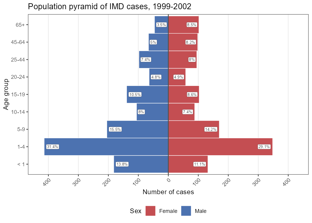
Asking your colleagues and scavenging through previous reports, you find a nice example you could try to replicate:
Part 4 · Reverse Engineering

What people tend to do is asking directly AI to create the graph for them. In many cases, that could be enough, certainly. But in the process 1) you haven’t learned anything; 2) you have zero control over the graph, and if something is wrong or not how you want it, you don’t know how to fix it or ask for it; 3) the resulting code will overwhelm you, making you less likely to play with it.

Does any of those points sound familiar from the previous session? Following our line, we won’t be asking directly for an output, but rather use a different approach: Reverse Engineering

A framework for Reverse Engineering
  1. Describe the goal, don’t hand over the picture. If you’re working from a reference image or a plot you found in a report, look at it and describe in your own words what it shows. Don’t upload the image and ask the AI to reproduce it — that skips the part where you figure out what’s going on.
  2. Describe your data precisely. Variables you want to use: names, types, and scale (how many categories, roughly what range of values for x and y axis). The more specific this is, the less the AI has to guess — and the less room there is for it to quietly invent a column you don’t have.
  3. Ask for the concept before the code. If something about the target looks like it needs a trick you don’t already know, ask what the trick is and why it works, before asking for the line of code that implements it.
  4. Build and verify one layer at a time. Ask for the smallest version that tests the idea. Run it. Check it did what you expected. Only then ask for the next layer.

Work your promt

Step 1 Describe the goal, don’t upload

Action — Without opening any AI tool yet, write down two or three sentences describing what’s above: how many bars per age group, what decides which side a bar points to, and what’s written inside each one. This description is what you’ll hand to the AI next.

Step 2 Describe your data

Action — Tell the AI what you’re starting from: age_group (a factor, nine ordered levels from < 1 to 65+), sex (character, Male/Female, with some missing values), and that you don’t yet have counts — only case-level rows in imd.

Step 3 Concept before code

Action — Ask what mechanism would make two ordinary horizontal bars point in opposite directions from the same zero point. Don’t ask for the ggplot2 code yet, ask for the idea in plain terms.

Step 4 Minimal possible example

Action — Start with the smallest version of your desired plot: counts by age_group and sex, the mirroring trick, and a plain geom_col() with no styling at all. This is the only code you should ask for in your initial prompt. No style, no color, no scale.

Action — Ask AI with your full prompt and run the code with the first version of your plot

Layer-building your graph

Once you have a starting graph that looks like two mirroring bars, that’s your checkpoint. Everything from here is decoration you already know how to ask for one piece at a time. Look at your target graph and try to identify the aspects that differ from your baseline plot, always thinking narratively.

Don’t ask everything at once, go layer by layer: add things and then run & check. It’s a back-and-forth process necessarily.

Action — Pay attention to the box with the percentages in every row, because you may need to perform extra actions or prepare the data accordingly. It can be a final step or be there from the beginning.

Action — Reach a final version of the suggested graph of your choice. There is no single correct/wrong output for this exercise, so feel free to play around and explore! That’s also part of the joy.

If you don’t know what to ask for

At the beginning you are not yet familiar with ggplot and the grammar of graphics, so it’s normal that you struggle to name all these layers you want to modify. It’s ok, you don’t actually need to know everything as long as your narrative description of your desired output is concise enough so that AI can turn that into the right code.

Another option would be using the example image you are replicating to ask AI about the different layers it can identify on the graph, and list them for you with a brief explanation of the options available for you to change. Still you are not asking AI to replicate, but to analyze the graph and decompose it for you to work with it. Reverse Engineering!

Part 5 · Has the pyramid changed over the years?

The pyramid lands well in the meeting. Someone from the vaccination unit asks the follow-up question you should have expected: “Does it look the same in 1999 as it does now?”

Let’s extend the plot to see all the four years, making use of something you already know from ggplot. Since we are expanding an existing plot, we can continue the conversation describing only what’s different from the plot you already built: one more grouping variable, one more layer to split the page into panels, and a decision about whether every panel shares the same scale or gets its own.

AI Memory Overload

For most AI tools, a single conversation can only go for so long. After a certain number of iterations, the model will start giving more misleading answers, forget previous context or even hallucinate. Some tools will warn you once you reach that point, others won’t. Keep this in mind, as the logical approach is to follow in the same conversation, but depending on the number and complexity of the iterations from Part 4, it may be a good idea to shift to a new conversation.

In that case, you can ask AI to produce a text summary of the conversation to provide context for the new conversation, a trick that usually works smoothly!

Action — Extend your Part 4 code into this one, learning what needs to change for it to work.

Once you have it working, look back at the x-axis: every panel shares the same range and the same breaks. That wasn’t ggplot2’s default — someone had to ask for it. Can you tell, just from looking at the plot, why fixing the scale mattered more here than it would for most facetted charts you’ve built so far?

Exercise Summary

Neither of the plots you worked today came from a single prompt, but rather from describing an objective narratively, asking for the idea behind the mirroring trick before asking for its code, and checking each layer before adding the next.

That habit — reverse engineering a picture instead of requesting one — is worth more than this particular plot. The next time an AI hands you a wall of ggplot2 code you didn’t ask to understand, you now have a way back in: strip it down to the smallest version that still looks right, and rebuild from there.

There is not a single solution for this exercise, but here is an example:

# --- Part 4: aggregated pyramid -------------------------------------------
pyramid_data <- imd %>% 
  filter(
    age_group != "Unknown",
    !is.na(sex)
  ) %>% 
  count(age_group, sex) %>% 
  group_by(sex) %>% 
  mutate(
    pct = round(n / sum(n) * 100, 1)
  ) %>% 
  ungroup() %>% 
  mutate(
    n     = if_else(sex == "Male", -n, n),
    label = paste0(pct, "%")
  )


pyramid_plot <- pyramid_data %>% 
  ggplot(aes(
    x    = n,
    y    = age_group,
    fill = sex
  )) +
  geom_col(
    width     = 1,
    colour    = "white",
    linewidth = 0.3
  ) +
  geom_label(
    aes(
      label = label,
      hjust = if_else(n < 0, -0.15, 1.15)
    ),
    colour        = "grey17",
    fill          = "white",
    size          = 2.3,
    label.size    = 0.1,
    label.padding = unit(0.15, "lines")
  ) +
  geom_vline(
    xintercept = 0,
    linewidth  = 0.6,
    colour     = "grey30"
  ) +
  scale_x_continuous(
    limits = c(-450, 450),
    breaks = seq(-400, 400, 100),
    labels = abs,
    expand = expansion(mult = 0.02)
  ) +
  scale_fill_manual(
    values = c(
      "Male"   = "#4C72B0",
      "Female" = "#C44E52"
    )
  ) +
  labs(
    x     = "Number of cases",
    y     = "Age group",
    fill  = "Sex",
    title = "Population pyramid of IMD cases, 1999-2002"
  ) +
  theme_bw() +
  theme(
    panel.grid.minor    = element_blank(),
    panel.grid.major.y  = element_blank(),
    axis.text.x         = element_text(angle = 45, hjust = 1),
    legend.position      = "bottom"
  )

pyramid_plot

# --- Part 5: facetted by year ----------------------------------------------

pyramid_data_year <- imd %>% 
  filter(
    age_group != "Unknown",
    !is.na(sex)
  ) %>% 
  count(year, age_group, sex) %>% 
  group_by(year, sex) %>% 
  mutate(
    pct = round(n / sum(n) * 100, 1)
  ) %>% 
  ungroup() %>% 
  mutate(
    n     = if_else(sex == "Male", -n, n),
    label = paste0(pct, "%")
  )

pyramid_plot_year <- pyramid_data_year %>% 
  ggplot(aes(
    x    = n,
    y    = age_group,
    fill = sex
  )) +
  geom_col(
    width     = 1,
    colour    = "white",
    linewidth = 0.3
  ) +
  geom_label(
    aes(
      label = label,
      hjust = if_else(n < 0, -0.15, 1.15)
    ),
    colour        = "grey17",
    fill          = "white",
    size          = 1.8,
    label.size    = 0.1,
    label.padding = unit(0.1, "lines")
  ) +
  geom_vline(
    xintercept = 0,
    linewidth  = 0.6,
    colour     = "grey30"
  ) +
  facet_wrap(
    ~ year,
    scales = "fixed"
  ) +
  scale_x_continuous(
    labels = abs,
    expand = expansion(mult = 0.02)
  ) +
  scale_fill_manual(
    values = c(
      "Male"   = "#4C72B0",
      "Female" = "#C44E52"
    )
  ) +
  labs(
    x     = "Number of cases",
    y     = "Age group",
    fill  = "Sex",
    title = "Population pyramid of IMD cases by year"
  ) +
  theme_bw() +
  theme(
    panel.grid.minor    = element_blank(),
    panel.grid.major.y  = element_blank(),
    axis.text.x         = element_text(angle = 45, hjust = 1),
    legend.position      = "bottom",
    strip.background     = element_blank(),
    #strip.background     = element_rect(fill = "white", colour = "grey60", linewidth = 0.4),
    strip.text           = element_text(colour = "steelblue", face = "bold", size = 10, hjust = 0.5),
    panel.spacing         = unit(1.2, "lines"),
    panel.border          = element_rect(colour = "grey70", fill = NA, linewidth = 0.4)
  )


pyramid_plot_year

:::

The teaching assistant
Source Code
---
title: "The design assistant"
subtitle: "Session 6 practical exercises"
---

```{r}
#| include: false
library(webexercises)
library(pacman)
pacman::p_load(tidyverse, rio, here, janitor)

imd <- import(here("data", "clean", "IMD_Sample_Clean.rds"))
```

The rates went out yesterday afternoon. Kassandra replied within the hour: *"Perfect for the report. But tomorrow's meeting is different — give me something striking that lands in three seconds, showing the crucial aspects of what happened in this years: a population pyramid ."*

You've never built one in R. And you know tomorrow's meeting is no joke, any graph or table shown in there had to be perfectly polished and good-looking. Can you do it in a couple of hours?

Asking your colleagues and scavenging through previous reports, you find a nice example you could try to replicate:

![](/images/exercises/S6E2_agepyramid.png){fig-align="center" width="561"}

## Part 4 · Reverse Engineering

What people tend to do is asking directly AI to create the graph for them. In many cases, that could be enough, certainly. But in the process 1) you haven't learned anything; 2) you have zero control over the graph, and if something is wrong or not how you want it, you don't know how to fix it or ask for it; 3) the resulting code will overwhelm you, making you less likely to play with it.

*Does any of those points sound familiar from the previous session*? Following our line, we won't be asking directly for an output, but rather use a different approach: **Reverse Engineering**

::: callout-note
### A framework for Reverse Engineering

1.  **Describe the goal, don't hand over the picture.** If you're working from a reference image or a plot you found in a report, look at it and describe in your own words what it shows. Don't upload the image and ask the AI to reproduce it — that skips the part where you figure out what's going on.
2.  **Describe your data precisely.** Variables you want to use: names, types, and scale (how many categories, roughly what range of values for x and y axis). The more specific this is, the less the AI has to guess — and the less room there is for it to quietly invent a column you don't have.
3.  **Ask for the concept before the code.** If something about the target looks like it needs a trick you don't already know, ask what the trick is and why it works, before asking for the line of code that implements it.
4.  **Build and verify one layer at a time.** Ask for the smallest version that tests the idea. Run it. Check it did what you expected. Only then ask for the next layer.
:::

### Work your promt

**Step 1 Describe the goal, don't upload**

**Action** — Without opening any AI tool yet, write down two or three sentences describing what's above: how many bars per age group, what decides which side a bar points to, and what's written inside each one. This description is what you'll hand to the AI next.

**Step 2 Describe your data**

**Action** — Tell the AI what you're starting from: `age_group` (a factor, nine ordered levels from `< 1` to `65+`), `sex` (character, `Male`/`Female`, with some missing values), and that you don't yet have counts — only case-level rows in `imd`.

**Step 3 Concept before code**

**Action** — Ask what mechanism would make two ordinary horizontal bars point in opposite directions from the same zero point. Don't ask for the ggplot2 code yet, ask for the idea in plain terms.

**Step 4 Minimal possible example**

**Action** — Start with the smallest version of your desired plot: counts by `age_group` and `sex`, the mirroring trick, and a plain `geom_col()` with no styling at all. This is the only code you should ask for in your initial prompt. No style, no color, no scale.

**Action** — Ask AI with your full prompt and run the code with the first version of your plot

### Layer-building your graph

Once you have a starting graph that looks like two mirroring bars, that's your checkpoint. Everything from here is decoration you already know how to ask for one piece at a time. Look at your target graph and try to identify the aspects that differ from your baseline plot, always thinking narratively.

Don't ask everything at once, go layer by layer: add things and then run & check. It's a back-and-forth process necessarily.

**Action** — Pay attention to the box with the percentages in every row, because you may need to perform extra actions or prepare the data accordingly. It can be a final step or be there from the beginning.

**Action** — Reach a final version of the suggested graph of your choice. There is no single correct/wrong output for this exercise, so feel free to play around and explore! That's also part of the joy.

::: callout-tip
## If you don't know what to ask for

At the beginning you are not yet familiar with ggplot and the grammar of graphics, so it's normal that you struggle to name all these layers you want to modify. It's ok, you don't actually need to know everything as long as your narrative description of your desired output is concise enough so that AI can turn that into the right code.

Another option would be using the example image you are replicating to ask AI about the different layers it can identify on the graph, and list them for you with a brief explanation of the options available for you to change. Still you are not asking AI to replicate, but to analyze the graph and decompose it for you to work with it. Reverse Engineering!
:::

## Part 5 · Has the pyramid changed over the years?

The pyramid lands well in the meeting. Someone from the vaccination unit asks the follow-up question you should have expected: *"Does it look the same in 1999 as it does now?"*

Let's extend the plot to see all the four years, making use of something you already know from ggplot. Since we are expanding an existing plot, we can continue the conversation describing only what's *different* from the plot you already built: one more grouping variable, one more layer to split the page into panels, and a decision about whether every panel shares the same scale or gets its own.

::: callout-important
## AI Memory Overload

For most AI tools, a single conversation can only go for so long. After a certain number of iterations, the model will start giving more misleading answers, forget previous context or even hallucinate. Some tools will warn you once you reach that point, others won't. Keep this in mind, as the logical approach is to follow in the same conversation, but depending on the number and complexity of the iterations from Part 4, it may be a good idea to shift to a new conversation.

In that case, you can ask AI to produce a text summary of the conversation to provide context for the new conversation, a trick that usually works smoothly!
:::

**Action —** Extend your Part 4 code into this one, learning what needs to change for it to work.

Once you have it working, look back at the x-axis: every panel shares the same range and the same breaks. That wasn't ggplot2's default — someone had to ask for it. Can you tell, just from looking at the plot, why fixing the scale mattered more here than it would for most facetted charts you've built so far?


## Exercise Summary

Neither of the plots you worked today came from a single prompt, but rather from describing an objective narratively, asking for the idea behind the mirroring trick before asking for its code, and checking each layer before adding the next.

That habit — reverse engineering a picture instead of requesting one — is worth more than this particular plot. The next time an AI hands you a wall of `ggplot2` code you didn't ask to understand, you now have a way back in: strip it down to the smallest version that still looks right, and rebuild from there.

There is not a single solution for this exercise, but here is an example:

```{r}
#| eval: false

# --- Part 4: aggregated pyramid -------------------------------------------
pyramid_data <- imd %>% 
  filter(
    age_group != "Unknown",
    !is.na(sex)
  ) %>% 
  count(age_group, sex) %>% 
  group_by(sex) %>% 
  mutate(
    pct = round(n / sum(n) * 100, 1)
  ) %>% 
  ungroup() %>% 
  mutate(
    n     = if_else(sex == "Male", -n, n),
    label = paste0(pct, "%")
  )


pyramid_plot <- pyramid_data %>% 
  ggplot(aes(
    x    = n,
    y    = age_group,
    fill = sex
  )) +
  geom_col(
    width     = 1,
    colour    = "white",
    linewidth = 0.3
  ) +
  geom_label(
    aes(
      label = label,
      hjust = if_else(n < 0, -0.15, 1.15)
    ),
    colour        = "grey17",
    fill          = "white",
    size          = 2.3,
    label.size    = 0.1,
    label.padding = unit(0.15, "lines")
  ) +
  geom_vline(
    xintercept = 0,
    linewidth  = 0.6,
    colour     = "grey30"
  ) +
  scale_x_continuous(
    limits = c(-450, 450),
    breaks = seq(-400, 400, 100),
    labels = abs,
    expand = expansion(mult = 0.02)
  ) +
  scale_fill_manual(
    values = c(
      "Male"   = "#4C72B0",
      "Female" = "#C44E52"
    )
  ) +
  labs(
    x     = "Number of cases",
    y     = "Age group",
    fill  = "Sex",
    title = "Population pyramid of IMD cases, 1999-2002"
  ) +
  theme_bw() +
  theme(
    panel.grid.minor    = element_blank(),
    panel.grid.major.y  = element_blank(),
    axis.text.x         = element_text(angle = 45, hjust = 1),
    legend.position      = "bottom"
  )

pyramid_plot

# --- Part 5: facetted by year ----------------------------------------------

pyramid_data_year <- imd %>% 
  filter(
    age_group != "Unknown",
    !is.na(sex)
  ) %>% 
  count(year, age_group, sex) %>% 
  group_by(year, sex) %>% 
  mutate(
    pct = round(n / sum(n) * 100, 1)
  ) %>% 
  ungroup() %>% 
  mutate(
    n     = if_else(sex == "Male", -n, n),
    label = paste0(pct, "%")
  )

pyramid_plot_year <- pyramid_data_year %>% 
  ggplot(aes(
    x    = n,
    y    = age_group,
    fill = sex
  )) +
  geom_col(
    width     = 1,
    colour    = "white",
    linewidth = 0.3
  ) +
  geom_label(
    aes(
      label = label,
      hjust = if_else(n < 0, -0.15, 1.15)
    ),
    colour        = "grey17",
    fill          = "white",
    size          = 1.8,
    label.size    = 0.1,
    label.padding = unit(0.1, "lines")
  ) +
  geom_vline(
    xintercept = 0,
    linewidth  = 0.6,
    colour     = "grey30"
  ) +
  facet_wrap(
    ~ year,
    scales = "fixed"
  ) +
  scale_x_continuous(
    labels = abs,
    expand = expansion(mult = 0.02)
  ) +
  scale_fill_manual(
    values = c(
      "Male"   = "#4C72B0",
      "Female" = "#C44E52"
    )
  ) +
  labs(
    x     = "Number of cases",
    y     = "Age group",
    fill  = "Sex",
    title = "Population pyramid of IMD cases by year"
  ) +
  theme_bw() +
  theme(
    panel.grid.minor    = element_blank(),
    panel.grid.major.y  = element_blank(),
    axis.text.x         = element_text(angle = 45, hjust = 1),
    legend.position      = "bottom",
    strip.background     = element_blank(),
    #strip.background     = element_rect(fill = "white", colour = "grey60", linewidth = 0.4),
    strip.text           = element_text(colour = "steelblue", face = "bold", size = 10, hjust = 0.5),
    panel.spacing         = unit(1.2, "lines"),
    panel.border          = element_rect(colour = "grey70", fill = NA, linewidth = 0.4)
  )


pyramid_plot_year
```
:::

© 2026 – Intro to R Course