Communication in field epidemiology is crucial for sharing the results of any project. Surveillance, research, outbreaks… they all rely on our capability of explaining complex information in a simple, understandable and striking way so that our message can be remembered.
R is amazing in doing so. Probably one of its strongest features. But with great power comes… a big difficulty in understanding and using all the possibilities the grammar of graphics has to offer us. We are here to guide you through your first steps, thanks to a fundamental aspect of ggplot: its modularity. Every plot is built following the same grammar model, so for you now the most important skill is understanding how a plot is designed. You will have plenty of time later to master those skills and create the most amazing graphs.
Kassandra is very well aware of the importance of graphs and communication, of course. Yesterday’s tables were only the appetizer, and now you are staring at her mail asking you to assist in the elaboration of a formal surveillance report of the past four seasons of IMD, to set up a new baseline for comparison of future trends.
Attached to it, you find the draft of the report with the sections and baseline info they want to include. Your task is creating the supporting graphs, for which you are given precise instructions on what to create - which takes most of the headache of making such decision. We will create those graphs across the exercises, make them beautiful and save them in high quality.
Before you start
Start a new script for Session 5 named after today’s topic — keep the habit of one script per task. Today you will only have a single script, but keep in mind you may want a script per graph in the future.
Load your packages (ggplot is part of the tidyverse) and import the clean dataset, the same one you already used throughout Session 4. Notice we are importing the .rds version, because we want to preserve all the format we need for producing nice outputs.
This first exercise is deliberately light. No new concept is hiding at the bottom of it — the goal is simply to get your hands used to the grammar before Kassandra starts asking for real graphs. Let’s follow the painter metaphor
Part 1 · The many brushes

Back in the lecture we have been exploring the distribution of the age of cases across sex, as a case study. The first plot we built was a boxplot of age_years by sex. Let’s start from exactly the same place and replicate the slides, step by step:
Action — Open for first blank canvas with ggplot() and pipe in the imd data. Run and see for yourself.
Action — Add your first aes() call, define x and y axis there. Is there any consequence in placing age_years and sex on one or the other axis? Run it and see for yourself again.
Action — Choose your brush-geom, a boxplot in this case.
Try to write the code yourself. See how much of the slide you can remember and replicate on the first attempt. Don’t worry if you find it difficult, that’s the point now. It will be piece of cake in two hours, believe me.
Expand the box below to find the code you will be replicating a hundred times from now on:
Hint
# Pipe the plot dataimd %>%# Open white canvasggplot(aes(# Define aesthetics: x and y axisx = ___,y = ___ )) +# choose your brushgeom_boxplot()
Action — Without touching aes() at all, swap geom_boxplot() for geom_violin(). Then swap it again for geom_point(). Then for geom_jitter().
What just happened
Look back at the four lines of aes() you wrote. Did you change a single character in any of them? The only thing moving was the name of the geom_*() function. That is the modularity of the grammar: what gets plotted and how it gets drawn are two separate decisions, and you can swap one without touching the other.
geom_point() and geom_jitter() show exactly the same data, but sex only has three possible values, so a lot of cases share the exact same age. Without jitter, those points stack perfectly on top of each other and you have no way of telling ten cases from one. From here on, we work with geom_jitter().
Missing data and plots
We know — because we cleaned it ourselves, that sex,serogroup, and death all contain missing (NA) values. Reporting and plotting are two different tasks, meaning that a table should transparently report on those values most of the times, while a plot can benefit from erasing them. These are delicate choices that have an impact, and should be agreed within the team and your supervisors beforehand.
For this exercise, we will get rid of missing values, equivalent to reporting only about known cases. In a real scenario, you would state that in a comment below each graph or inline within the main body text.
Part 2 · Aesthetics for our plot
Static values
You can tell geom_jitter() to use a fixed color, size and transparency for every single point, regardless of what that point represents. These three go outsideaes(), because they are not connected to any column in your data — just a styling choice, the same for every row.

Action — Filter away missing sexvalues before piping data into the ggplot() call.
Action — Set the points to color = "steelblue", size = 2 and alpha = 0.6. Keep the vertical, one-argument-per-line style. Also, play with the 2 and 0.6 values to see how they change the plot. The alpha can range between 0-1 only.
However, it doesn’t feel natural coloring all dots the same, right? Ideally it would be one color per category
Dynamic values
Now we want the color to stop being a fixed decision and start representing something, be it another variable or the same sex to define one color per sex.
Action — Move color inside aes() and map it to sex. Leave size and alpha exactly where they are.
Action — Play around with other coloring variables to see what happens. But retain sex for continuing the exercise.
Why do size and alpha stay outside aes() while color moves inside?
Part 3 · A little scale
Let’s fix the age_years axis appearance by changing the breaks — the little numbers in the axis indicating the range of values represented, like we did in the presentation:

Action — Add scale_y_continuous() with the arguments name and breaks
Action — Use either a vector c(0, 5, 15, ...) with your breaks of choice or the seq(from, to, by) function specifying the initial and final values, and the width of each jump i.e., from 0 to 90 years with 10 years jumps.
Tell me something: is the legend in this graph really necessary? Is it contributing information that the labels of your sex axis is not providing? Not really. We only used the color aesthetic because we wanted one separate color for males and females. Can we get rid of that? Well, of course.
Action — Just add this scale to your plot code:
scale_colour_discrete(guide ="none")
<ggproto object: Class ScaleDiscrete, Scale, gg>
aesthetics: colour
axis_order: function
break_info: function
break_positions: function
breaks: waiver
call: call
clone: function
dimension: function
drop: TRUE
expand: waiver
fallback_palette: function
get_breaks: function
get_breaks_minor: function
get_labels: function
get_limits: function
get_transformation: function
guide: none
is_discrete: function
is_empty: function
labels: waiver
limits: NULL
make_sec_title: function
make_title: function
map: function
map_df: function
minor_breaks: waiver
n.breaks.cache: NULL
na.translate: TRUE
na.value: grey50
name: waiver
palette: NULL
palette.cache: NULL
position: left
range: environment
rescale: function
reset: function
train: function
train_df: function
transform: function
transform_df: function
super: <ggproto object: Class ScaleDiscrete, Scale, gg>
Modify the color scale which is a discrete (categorical) variable
Modify the guide (the legend)
Erase it guide = "none"
Part 4 · Final framing
Now, the plot started looking quite good! Still, that grey default background is not very appalling. All the non-data details of the graph are customized through the theme() function of ggplot. But it’s a really complicated set of arguments and values to define, so we will just use the default themes that ggplot provide — and most people use for their plots, believe me.

Action — Finalise the plot code with a default call to any theme: theme_minimal(), bw or classic
From this exercise onward, we will be adding one of the themes at the end of every plot - it’s up to you which one you prefer of fits better with the graph.
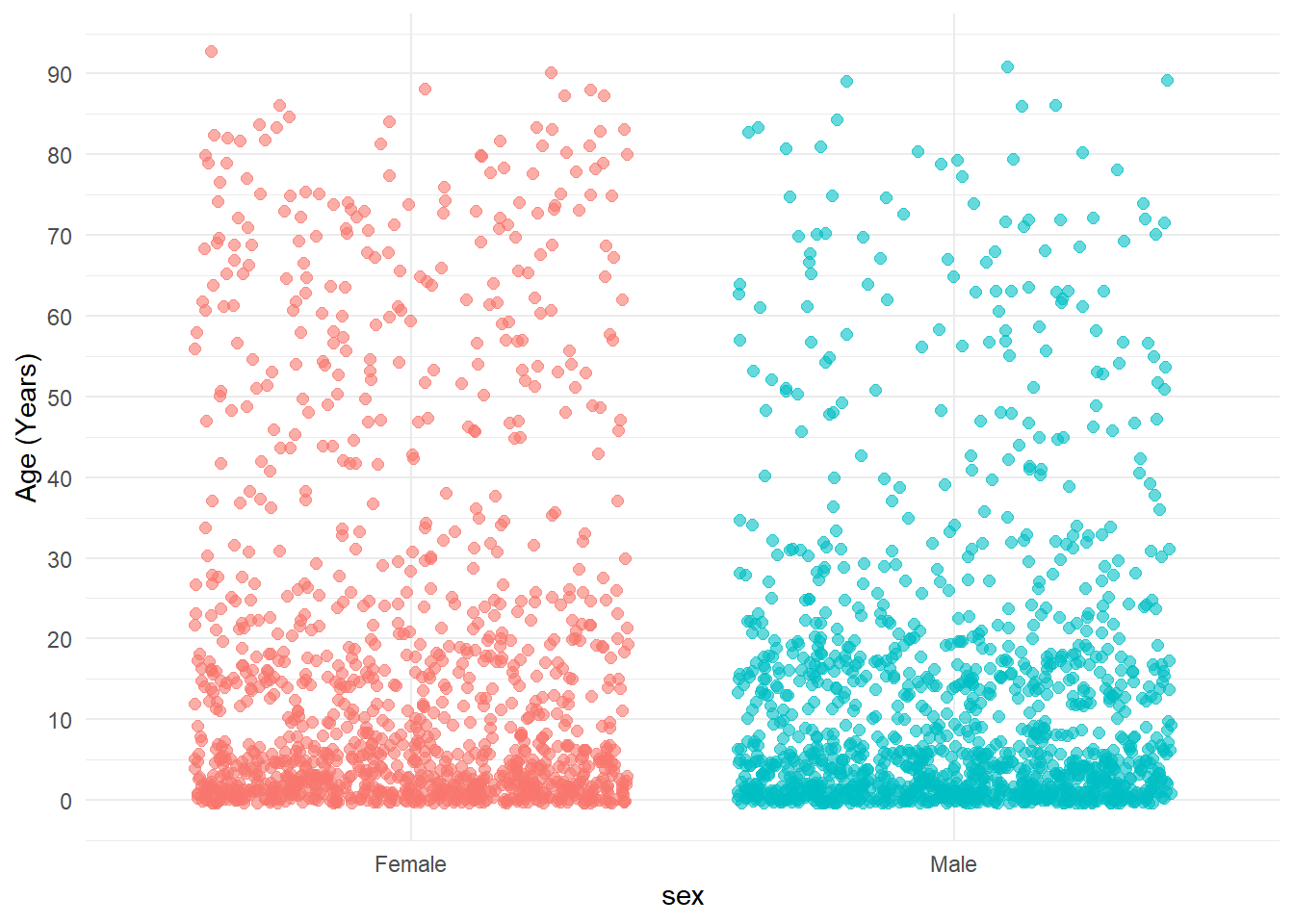
Final plot
Your final plot should look like this. If you chose to map different x or y axis it’s more than ok, and also a way of realizing how choices in here don’t result in error messages but in different graphs — and yes, sometime also in errors
Saving your plot
Close the exercise the way you will close most of your plotting scripts from now on: with ggsave().
We haven’t assigned yet the plot to any object. Strictly speaking, it’s not necessary for saving, but when creating multiple plots at once it’s better practice to do like this:
Action — Assign the plot to an object jitter_plot, for example. What is its class()? How does it look in the environment? What happens when you call it again?
Action — Fill in the blanks below and save your plot in your outputs folder. You will need to play with the width and height values. Because of the vectorial nature of R, “bigger” saved plots (i.e 10 x 10) will result in “smaller” looking elements like text labels and dots. On the contrary, “smaller” saved plots (i.e., 5x5) will result in zoomed-in like output. Play around with the numbers and find out for yourself.
ggsave(plot = ___, # the plot objectfilename = ___, # don't forget the extension .png, .jpeg, .tiff, etc.path = ___, # a call with here()units ="in",width = ___,height = ___,dpi =300# for a high-quality output)
Hint
ggsave() saves the last plot you drew by default if you don’t specify the plot argument, so you can run it right after your final plot without assigning anything first. filename needs its extension (.png, for instance); path is the folder you want it saved into.
Exercise Summary
You just built your first complete ggplot2 chain from scratch — same aes(), four different brushes, then a static style turned into a data-driven one. Scales for better breaks in the age axis, and erasing the legend of the sex coloring. All finally styled with a default theme before saving.
Nothing here required a new concept; it required getting your hands used to the pattern. In E2 the geometries start to bite back, with a real error message waiting for you.
Function
Package
What it does
ggplot()
ggplot2
Opens the canvas: sets the dataset and, optionally, the global aes()
aes()
ggplot2
Declares which variables are mapped, and where
geom_jitter()
ggplot2
Draws individual points, nudging apart the ones that overlap
color, size, alpha (outside aes())
ggplot2
Fixed style, identical for every point
color, size, alpha (inside aes())
ggplot2
Represent a variable from the data
scale_x_continuous(), scale_y_continuous()
ggplot2
Modify x/y axis when a continuous variable is supplied
scale_color_discrete()
ggplot2
Modify the color aesthetic inside aes() when a categorical variable is mapped
---title: "Scatterplot - your first plot"subtitle: "Session 5 practical exercises"---```{r}#| include: falselibrary(webexercises)library(pacman)p_load(rio, here, tidyverse, janitor)imd <-import(here("data", "clean", "IMD_Sample_Clean.rds"))```Communication in field epidemiology is crucial for sharing the results of any project. Surveillance, research, outbreaks... they all rely on our capability of explaining complex information in a simple, understandable and striking way so that our message can be remembered.R is amazing in doing so. Probably one of its strongest features. But with great power comes... a big difficulty in understanding and using all the possibilities the ***grammar of graphics*** has to offer us. We are here to guide you through your first steps, thanks to a fundamental aspect of ggplot: its modularity. Every plot is built following the same grammar model, so for you now the most important skill is understanding how a plot is designed. You will have plenty of time later to master those skills and create the most amazing graphs.Kassandra is very well aware of the importance of graphs and communication, of course. Yesterday's tables were only the appetizer, and now you are staring at her mail asking you to assist in the elaboration of a formal surveillance report of the past four seasons of IMD, to set up a new baseline for comparison of future trends.Attached to it, you find the draft of the report with the sections and baseline info they want to include. Your task is creating the supporting graphs, for which you are given precise instructions on what to create - which takes most of the headache of making such decision. We will create those graphs across the exercises, make them beautiful and save them in high quality.## Before you startStart a new script for Session 5 named after today's topic — keep the habit of one script per task. Today you will only have a single script, but keep in mind you may want a script per graph in the future.Load your packages (ggplot is part of the tidyverse) and import the clean dataset, the same one you already used throughout Session 4. Notice we are importing the `.rds` version, because we want to preserve all the format we need for producing nice outputs.This first exercise is deliberately light. No new concept is hiding at the bottom of it — the goal is simply to get your hands used to the grammar before Kassandra starts asking for real graphs. Let's follow the painter metaphor## Part 1 · The many brushes{fig-align="center" width="391"}Back in the lecture we have been exploring the distribution of the age of cases across sex, as a case study. The first plot we built was a boxplot of `age_years` by `sex`. Let's start from exactly the same place and replicate the slides, step by step:**Action** — Open for first blank canvas with `ggplot()` and pipe in the `imd` data. Run and see for yourself.**Action** — Add your first `aes()` call, define `x` and `y` axis there. Is there any consequence in placing `age_years` and `sex` on one or the other axis? Run it and see for yourself again.**Action** — Choose your brush-geom, a boxplot in this case.Try to write the code yourself. See how much of the slide you can remember and replicate on the first attempt. Don't worry if you find it difficult, that's the point now. It will be piece of cake in two hours, believe me.Expand the box below to find the code you will be replicating a hundred times from now on:::: {.callout-tip collapse="true" appearance="simple" icon="false"}## Hint``` r# Pipe the plot dataimd %>%# Open white canvasggplot(aes(# Define aesthetics: x and y axisx = ___,y = ___ )) +# choose your brushgeom_boxplot()```:::**Action** — Without touching `aes()` at all, swap `geom_boxplot()` for `geom_violin()`. Then swap it again for `geom_point()`. Then for `geom_jitter()`.::: callout-note## What just happenedLook back at the four lines of `aes()` you wrote. Did you change a single character in any of them? The only thing moving was the name of the `geom_*()` function. That is the modularity of the grammar: *what* gets plotted and *how* it gets drawn are two separate decisions, and you can swap one without touching the other.:::`geom_point()` and `geom_jitter()` show exactly the same data, but `sex` only has three possible values, so a lot of cases share the exact same age. Without jitter, those points stack perfectly on top of each other and you have no way of telling ten cases from one. From here on, we work with `geom_jitter()`.::: callout-caution## Missing data and plotsWe know — because we cleaned it ourselves, that `sex`,`serogroup`, and `death` all contain missing (`NA`) values. Reporting and plotting are two different tasks, meaning that a table should transparently report on those values most of the times, while a plot can benefit from erasing them. These are delicate choices that have an impact, and should be agreed within the team and your supervisors beforehand.For this exercise, we will get rid of missing values, equivalent to reporting only about known cases. In a real scenario, you would state that in a comment below each graph or inline within the main body text.:::## Part 2 · Aesthetics for our plot### Static valuesYou can tell `geom_jitter()` to use a fixed color, size and transparency for every single point, regardless of what that point represents. These three go **outside** `aes()`, because they are not connected to any column in your data — just a styling choice, the same for every row.::: column-margin{.lightbox width="95"}:::**Action** — Filter away missing `sex`values before piping data into the `ggplot()` call.**Action** — Set the points to `color = "steelblue"`, `size = 2` and `alpha = 0.6`. Keep the vertical, one-argument-per-line style. Also, play with the 2 and 0.6 values to see how they change the plot. The `alpha` can range between 0-1 only.However, it doesn't feel natural coloring all dots the same, right? Ideally it would be one color per category### Dynamic valuesNow we want the color to stop being a fixed decision and start **representing** something, be it another variable or the same `sex` to define one color per sex.**Action** — Move `color` inside `aes()` and map it to `sex`. Leave `size` and `alpha` exactly where they are.**Action** — Play around with other coloring variables to see what happens. But retain `sex` for continuing the exercise.```{r}#| echo: falseopts1 <-c("Because `size` and `alpha` only accept numeric variables, and `sex` is categorical",answer ="Because `size` and `alpha` are still a fixed styling choice — they are not representing any variable, so they stay outside `aes()`","Because a geometry can only have one dynamic aesthetic at a time","Because `color` is the only aesthetic allowed inside `aes()`")```**Why do `size` and `alpha` stay outside `aes()` while `color` moves inside?**`r longmcq(opts1)`## Part 3 · A little scaleLet's fix the `age_years` axis appearance by changing the breaks — the little numbers in the axis indicating the range of values represented, like we did in the presentation:::: column-margin{.lightbox width="132"}:::**Action** — Add `scale_y_continuous()` with the arguments `name` and `breaks`**Action** — Use either a vector `c(0, 5, 15, ...)` with your breaks of choice or the `seq(from, to, by)` function specifying the initial and final values, and the width of each jump i.e., from 0 to 90 years with 10 years jumps.Tell me something: is the legend in this graph really necessary? Is it contributing information that the labels of your `sex` axis is not providing? Not really. We only used the `color` aesthetic because we wanted one separate color for males and females. Can we get rid of that? Well, of course.**Action** — Just add this scale to your plot code:```{r}scale_colour_discrete(guide ="none")```- Modify the `color` scale which is a discrete (categorical) variable- Modify the `guide` (the legend)- Erase it `guide = "none"`## Part 4 · Final framingNow, the plot started looking quite good! Still, that grey default background is not very appalling. All the non-data details of the graph are customized through the `theme()` function of ggplot. But it's a really complicated set of arguments and values to define, so we will just use the default themes that ggplot provide — and most people use for their plots, believe me.::: column-margin{.lightbox width="130"}:::**Action** — Finalise the plot code with a default call to any theme: `theme_minimal()`, `bw` or `classic`From this exercise onward, we will be adding one of the themes at the end of every plot - it's up to you which one you prefer of fits better with the graph.## Final plotYour final plot should look like this. If you chose to map different `x` or `y` axis it's more than ok, and also a way of realizing how choices in here don't result in error messages but in different graphs — and yes, sometime also in errors```{r}#| echo: false#| message: false#| warning: false# Final plotimd %>%filter(!is.na(sex)) %>%ggplot(aes(x = sex,y = age_years,color = sex )) +geom_jitter(size =2,alpha =0.6 )+scale_y_continuous(name ="Age (Years)", breaks =seq(0, 90, 10) ) +scale_colour_discrete(guide ="none") +theme_minimal()```## Saving your plotClose the exercise the way you will close most of your plotting scripts from now on: with `ggsave()`.We haven't assigned yet the plot to any object. Strictly speaking, it's not necessary for saving, but when creating multiple plots at once it's better practice to do like this:**Action** — Assign the plot to an object `jitter_plot`, for example. What is its `class()`? How does it look in the environment? What happens when you call it again?**Action** — Fill in the blanks below and save your plot in your outputs folder. You will need to play with the width and height values. Because of the vectorial nature of R, "*bigger*" saved plots (i.e 10 x 10) will result in "smaller" looking elements like text labels and dots. On the contrary, "*smaller*" saved plots (i.e., 5x5) will result in zoomed-in like output. Play around with the numbers and find out for yourself.``` rggsave(plot = ___, # the plot objectfilename = ___, # don't forget the extension .png, .jpeg, .tiff, etc.path = ___, # a call with here()units ="in",width = ___,height = ___,dpi =300# for a high-quality output)```::: {.callout-tip collapse="true" appearance="simple" icon="false"}## Hint`ggsave()` saves the last plot you drew by default if you don't specify the `plot` argument, so you can run it right after your final plot without assigning anything first. `filename` needs its extension (`.png`, for instance); `path` is the folder you want it saved into.:::------------------------------------------------------------------------## Exercise SummaryYou just built your first complete `ggplot2` chain from scratch — same `aes()`, four different brushes, then a static style turned into a data-driven one. Scales for better breaks in the age axis, and erasing the legend of the sex coloring. All finally styled with a default theme before saving.Nothing here required a new concept; it required getting your hands used to the pattern. In E2 the geometries start to bite back, with a real error message waiting for you.| Function | Package | What it does ||------------------------|------------------------|------------------------|| `ggplot()` | ggplot2 | Opens the canvas: sets the dataset and, optionally, the global `aes()` || `aes()` | ggplot2 | Declares which variables are mapped, and where || `geom_jitter()` | ggplot2 | Draws individual points, nudging apart the ones that overlap || `color`, `size`, `alpha` (outside `aes()`) | ggplot2 | Fixed style, identical for every point || `color`, `size`, `alpha` (inside `aes()`) | ggplot2 | Represent a variable from the data || `scale_x_continuous(), scale_y_continuous()` | ggplot2 | Modify x/y axis when a continuous variable is supplied || `scale_color_discrete()` | ggplot2 | Modify the color aesthetic inside `aes()` when a categorical variable is mapped || `theme_minimal()` | ggplot2 | Applies a predefined visual theme || `ggsave()` | ggplot2 | Saves the last plot drawn to a file |::: {.callout-tip collapse="true"}## 💡 Show solution — only after trying yourself!``` r# Load librarieslibrary(pacman)p_load(rio, here, tidyverse)# Import dataimd <-import(here("data", "clean", "IMD_Sample_Clean.rds"))# Same aes(), different brushimd %>%ggplot(aes(x = sex,y = age_years )) +geom_boxplot()imd %>%ggplot(aes(x = sex,y = age_years )) +geom_violin()imd %>%ggplot(aes(x = sex,y = age_years )) +geom_point()imd %>%ggplot(aes(x = sex,y = age_years )) +geom_jitter()# Static styleimd %>%filter(!is.na(sex)) %>%ggplot(aes(x = sex,y = age_years )) +geom_jitter(color ="steelblue",size =2,alpha =0.6 )# Dynamic style imd %>%filter(!is.na(sex)) %>%ggplot(aes(x = sex,y = age_years,color = sex )) +geom_jitter(size =2,alpha =0.6 )# Scalingimd %>%filter(!is.na(sex)) %>%ggplot(aes(x = sex,y = age_years,color = sex )) +geom_jitter(size =2,alpha =0.6 ) +scale_y_continuous(name ="Age (Years)", breaks =seq(0, 90, 10) ) +scale_colour_discrete(guide ="none")# Final plotjitter_plot <- imd %>%filter(!is.na(sex)) %>%ggplot(aes(x = sex,y = age_years,color = sex )) +geom_jitter(size =2,alpha =0.6 )+scale_y_continuous(name ="Age (Years)", breaks =seq(0, 90, 10) ) +scale_colour_discrete(guide ="none") +theme_minimal()ggsave(plot = jitter_plot,filename ="age_sex_jitter.png",path =here("outputs"),units ="in",width =7,height =5,dpi =300)```:::```{=html}<script>document.addEventListener("DOMContentLoaded", function() { var radiogroups = document.getElementsByClassName("webex-radiogroup"); for (var i = 0; i < radiogroups.length; i++) { radiogroups[i].onchange = radiogroups_func; }});</script>```
